CAWEB Master’s website
Leading 13 people to rethink and improve an institutional website.
The CAWEB Master’s at the University of Strasbourg is taught 100% online in English. As project manager I led 13 people around the world: 7 on social media and 6 on the website. I presented the website progress report: research, content audit, personas, a new information architecture and a program comparison table, now live on the site.
The challenge
The site held a lot of information but was hard to navigate, text-heavy and light on multimedia, testimonials and clear calls to action. Prospective students struggled to compare the three programs and find admissions information.
Goal. Make the programs easy to understand and compare, and improve navigation and engagement to attract more applicants.
My role
- Project manager for 13 people across countries, split into a social media team (7) and a website team (6)
- Planned the work in phases from November to February and presented progress reports
- Led the website research: competitor analysis, SWOT, survey, content audit and personas
- Mapped the site flow in FigJam and fixed broken links, wrong links and non-working buttons
- Proposed a new landing page with a three-program comparison in Figma and helped implement the new information architecture and program table on the live site
How we got there.
Kick-off & phases
Two teams and four phases: Observation, Point of view, Ideate, Wireframing and prototyping.
Competitor analysis
Seven programs compared on structure, calls to action, responsiveness, accessibility, formats and price.
User research
Survey with 16 responses, a content audit mapped in FigJam and four personas.
Quick wins
Broken links, wrong links and non-working buttons found and fixed.
Design & implementation
Landing page with a three-program table designed in Figma, then implemented on the live site with a new information architecture and SEO keywords per page.
What it looked like.
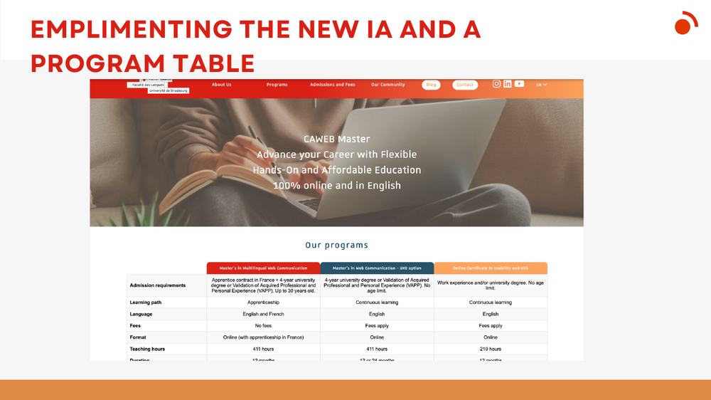
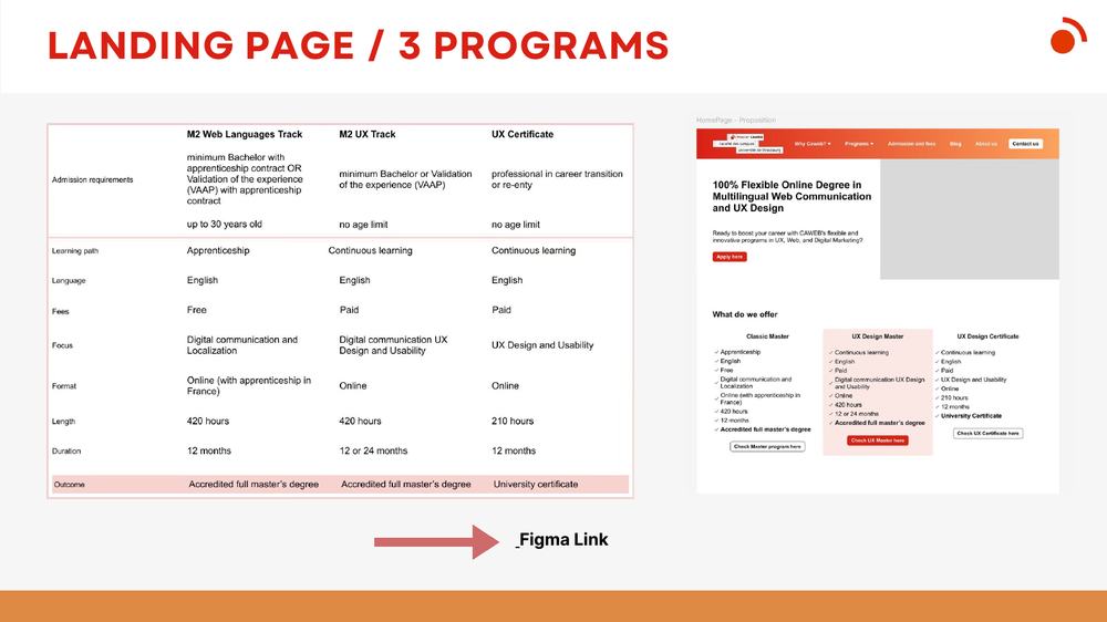
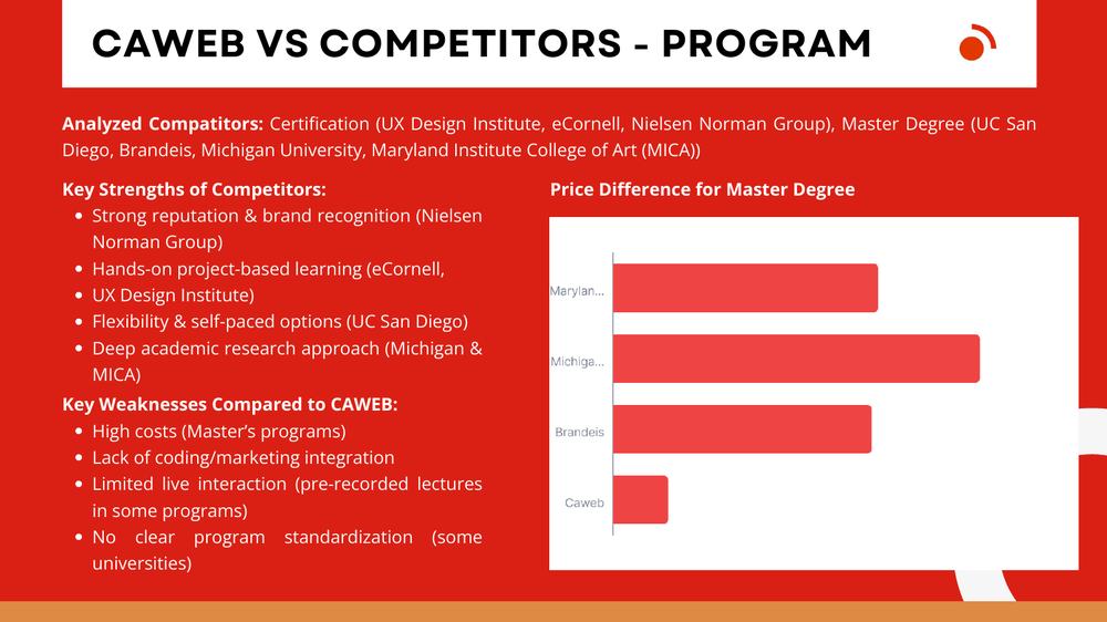
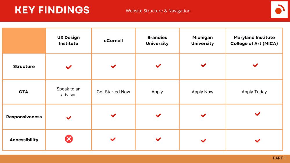
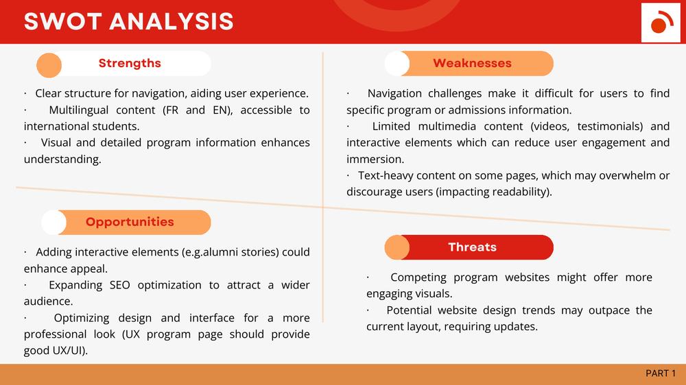
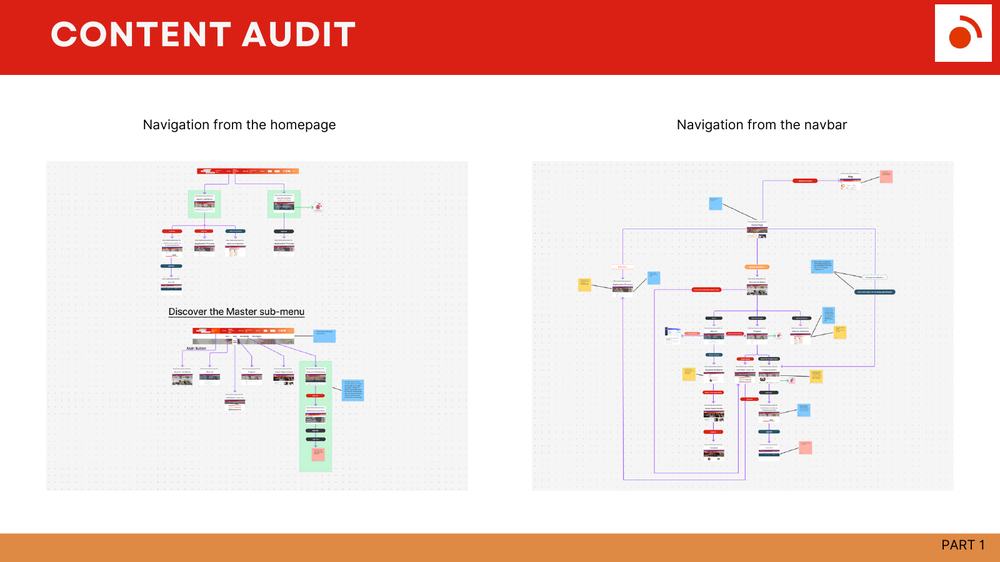
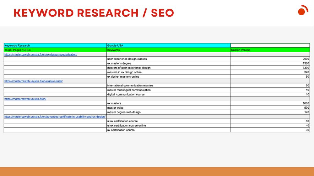
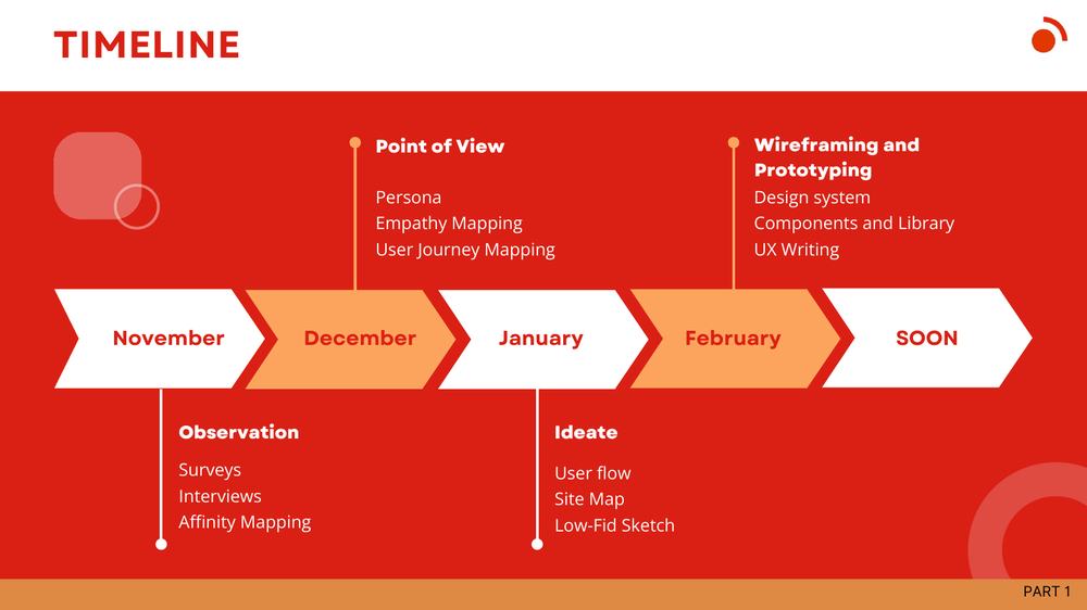
Slides from my progress report on the management of the institutional website (December 2024).
What changed.
Findings: navigation made program and admissions information hard to find, multimedia and testimonials were limited, and some pages were text-heavy.
Delivered and live: a clearer landing page and program table, a new information architecture, fixed links and buttons, keyword research per page (2,900 searches in Google USA for “user experience design classes”) and a blog plan.
What I learned
Managing two teams across time zones taught me that a visible timeline and one clear owner per deliverable beat any amount of tooling.