Centennial College
Why applying to a college feels harder than it should.
A usability study of Centennial College’s Interactive Media Management website, focused on the application process and on international students. Our team combined a heuristic evaluation with moderated usability testing and interviews.
The challenge
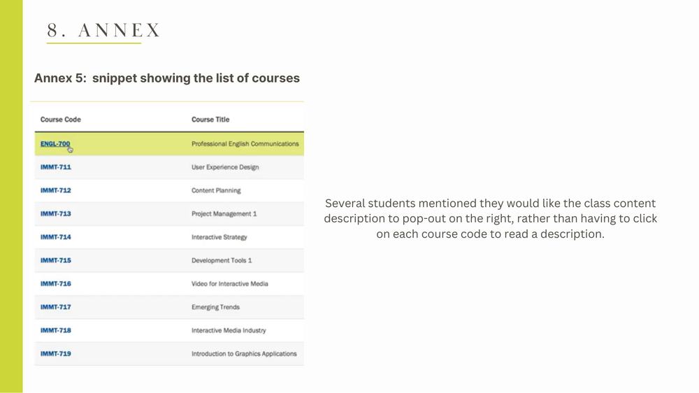
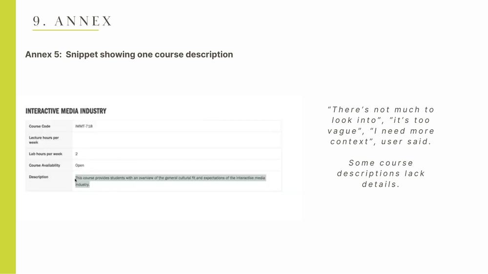
Prospective students struggled to find course details and complete an application that felt long and unclear, especially international students handling visas and documents.
Goal. Find out where users get lost or frustrated in the application journey, and recommend fixes the college can act on.
My role
- Helped choose the topic and the methods
- Developed the research questions and the usability test script
- Coordinated interview scheduling and took part in interviews
- Ran a heuristic evaluation and structured the final report
How we got there.
Questions & hypotheses
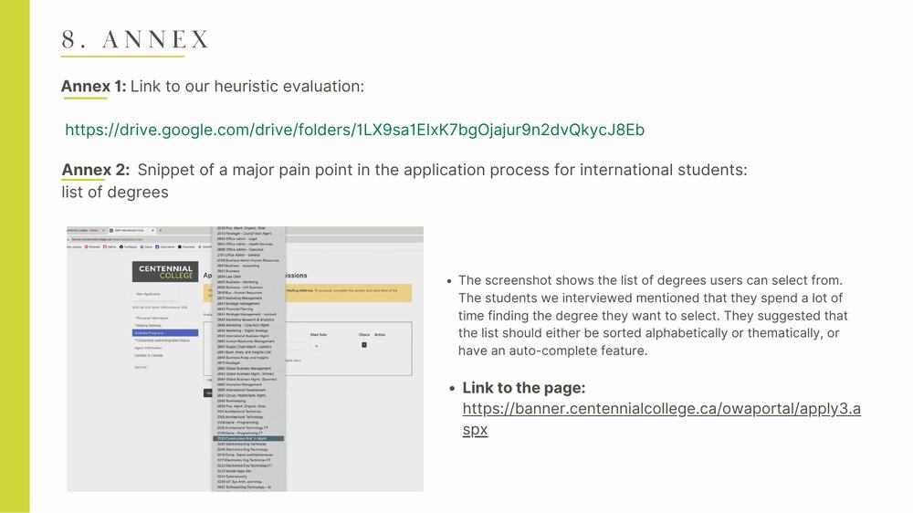
Information overload, long journeys, poor prioritisation, a complex application.
Heuristic evaluation
Each of us applied Nielsen’s 10 heuristics, then we compared findings.
Research plan & script
Metrics: task success, errors (severity 0–4), time on task, navigation, mobile, satisfaction.
Moderated testing & interviews
Participants completed key tasks while we observed.
Synthesis & recommendations
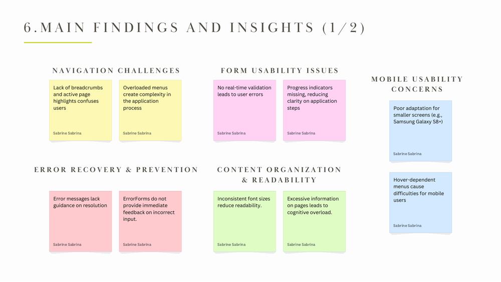
Affinity mapping into five themes and a set of fixes.
What it looked like.
What changed.
Five usability challenges: complex navigation, form issues, weak mobile adaptation, content overload, and poor error recovery.
Recommendations: breadcrumbs and active-page highlights, real-time validation and progress indicators, touch-friendly menus without hover, clearer content hierarchy and readable error messages.
What I learned
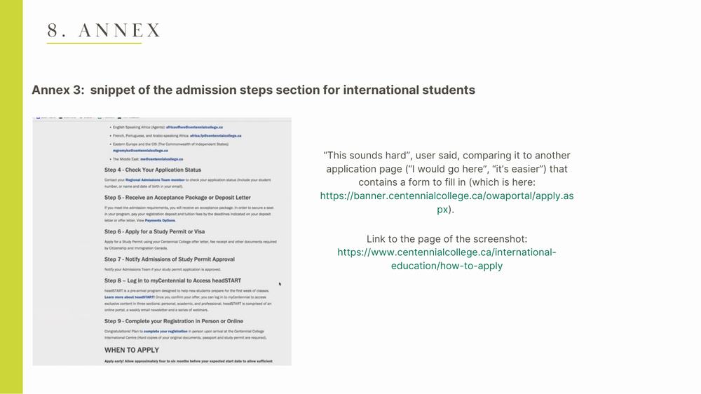
The best findings came from watching people compare two pages and say which one they would use. Their words did more than any checklist.